Robert, excellent point. Here are comparisons to the other indexes using FRED data.
DOW to GDP Ratio
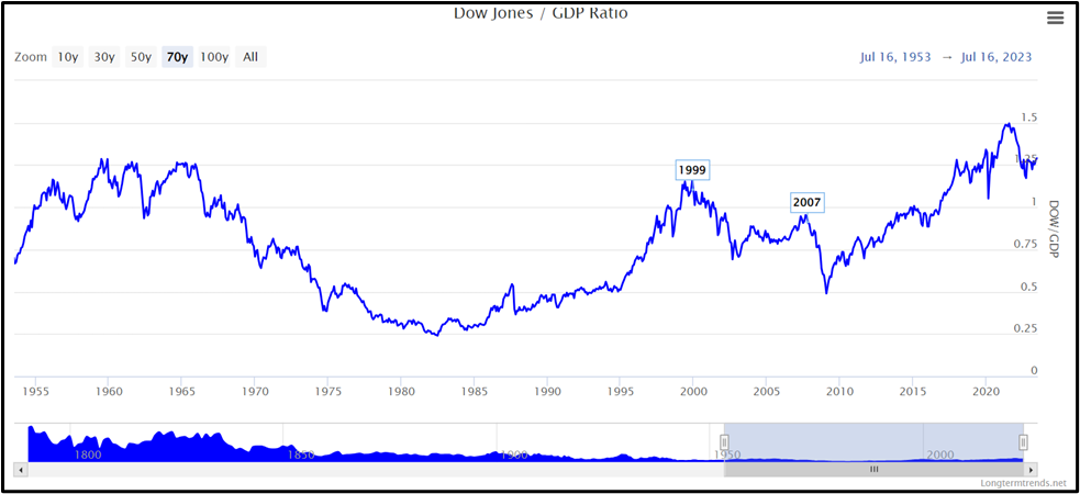 Dow Jones / GDP Ratio
Interpretation
Similar to the Buffett Indicator, the Dow Jones to GDP ratio provides insights into the relative valuation of the stock market compared to the size of the economy. In contrast to the Wilshire 5000, the Dow Jones only contains 30 publicly traded companies. The index is price-weighted, so stocks with a higher share price are given greater weight. For these reasons, it is not as accurate as the Wilshire 5000 for measuring the market capitalization. However, all these ratios look very similar - and since some calculations for the Dow Jones go back to 1790, this ratio provides an interesting historical perspective.
Data Sources
Recent data
Federal Reserve Bank of St. Louis: US Gross Domestic Product
Federal Reserve Bank of St. Louis: Dow Jones
Historical data
Congressional Budget Office: Historical Gross Domestic Product
Wikipedia: Historical Dow Jones prices
Further Information
Investopedia: Dow Jones Industrial Average - DJIA
<v:shape type="#_x0000_t75" alt="A graph on a computer screen
Description automatically generated" style="position: absolute; left: 0; text-align: left; margin-left: 1.5pt; margin-top: 33.75pt; width: 468pt; height: 211.6pt; z-index: 251663360; visibility: visible; mso-wrap-style: square; mso-width-percent: 0; mso-height-percent: 0; mso-wrap-distance-left: 9pt; mso-wrap-distance-top: 0; mso-wrap-distance-right: 9pt; mso-wrap-distance-bottom: 0; mso-position-horizontal: absolute; mso-position-horizontal-relative: text; mso-position-vertical: absolute; mso-position-vertical-relative: text; mso-width-relative: page; mso-height-relative: page;" stroked="t" strokecolor="black [3213]" strokeweight="1.5pt"> </v:shape>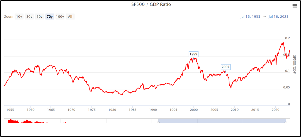 S&P 500 to GDP Ratio
Interpretation
The S&P 500 to GDP ratio, like the Buffett Indicator, assesses the stock market's valuation relative to the economy. However, it specifically considers the market capitalization of the 500 companies in the index, while the Buffett Indicator covers all publicly traded stocks. The S&P 500 ratio offers a narrower view, focusing on large-cap companies, while the Buffett Indicator provides a broader perspective of the entire market, including smaller-cap stocks and companies outside the S&P 500.
However, the S&P 500 is still just a proxy for the total value of all US publicly-traded equities and over the long-term the S&P 500 to GDP ratio deviated from the Buffett indicator. According to this paper (page A56), the US Market Cap to GDP ratio in the late 1800's was around 50%, which is a third of what it was during the Dot-com bubble of 2000.
Data Sources
Recent data
Federal Reserve Bank of St. Louis: US Gross Domestic Product
Federal Reserve Bank of St. Louis: S&P 500
Historical data
Congressional Budget Office: Historical Gross Domestic Product
Nasdaq: S&P 500
Further Information
dkuvshinov.com The Big Bang: Stock Market Capitalization in the Long Run
Investopedia: S&P 500 Index – Standard & Poor's 500 Index
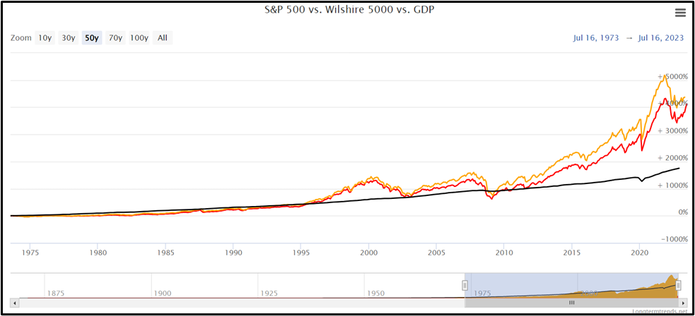
The Stock Market vs. GDP - S&P 500 vs. Wilshire 5000 vs. GDP
 Interpretation
Just like the Wilshire 5000, the S&P 500 is a capitalization-weighted Index. It captures approximately 80% of the available total market capitalization. Therefore, it is quite representative of the entire stock market. Intuitively, the stock market and the overall economy should grow with a similar pace.
Data Sources
Recent data
Federal Reserve Bank of St. Louis: US Gross Domestic Product
Federal Reserve Bank of St. Louis: S&P 500
Federal Reserve Bank of St. Louis: Wilshire 5000 Full Cap Price Index
Historical data
Congressional Budget Office: Historical Gross Domestic Product
Nasdaq: S&P 500
https://www.longtermtrends.net/market-cap-to-gdp-the-buffett-indicator/
------------------------------
BARRY JOHNSON
------------------------------
Original Message:
Sent: 07-18-2023 13:59
From: ROBERT ADAMS
Subject: Is there value anywhere?
Thank you for the post, Barry. It certainly adds evidence that the overall market is overvalued. But remember that the Wilshire 5000 is cap weighted, so the big dogs are the ones most likely to be responsible for the altitude. There is still plenty of value to be found in individual smaller companies. Nevertheless, your post does raise concerns about the 5-year future for most cap-weighted funds.
------------------------------
Rob Adams
------------------------------
Original Message:
Sent: 07-18-2023 13:09
From: BARRY JOHNSON
Subject: Is there value anywhere?
Vinod
Thank you for posing this simple, but fundamental, question.
AAII member comments indicate the consensus believes your question is very prescient in 2023. However, most of the investing community continues to invest in equity markets despite very high valuations. Although many may not understand the concept of "value investing, " their behavior indicates that they expect to obtain "value" through stock appreciation independent of the overall economic and market environment conditions. I am not as sophisticated or erudite as they.
Rather than preach the value of fundamental analysis to the unwashed masses who are surfing the "rad, snarly, totally tubular" waves of today's overpriced market, I thought I might assist them with a way to evaluate their investment strategy using the most basic indicator I know -- the Buffet Indicator. This market valuation measure may be obscure to many.
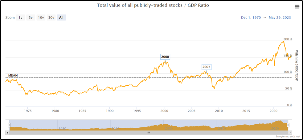
So I downloaded some explanatory text and a chart with data from the Federal Reserve FRED database (see below) that provides comparative data to evaluate today's overall market valuation using the latest data available (July 14, 2023).
"The Buffett Indicator, also known as Market Cap to GDP, has gained prominence as a long-term valuation indicator for stocks, largely due to Warren Buffett's endorsement. In a Fortune Magazine interview back in 2001, Buffett referred to it as "probably the best single measure of where valuations stand at any given moment." This statement has drawn attention to the indicator's potential significance in assessing market conditions. The calculation of the Buffett Indicator involves dividing the total market value of all publicly-traded stocks within a country by the country's Gross Domestic Product (GDP). By comparing the stock market's size to the overall economic output, this ratio provides insights into the relative valuation of the market. To illustrate this concept, one common approach is to examine the ratio between the Wilshire 5000 and the GDP of the United States. The Wilshire 5000 is widely regarded as the definitive benchmark for the US equity market, aiming to measure the total market capitalization of all US equity securities with readily available price data. By dividing this market index by the GDP, we can obtain a snapshot of the market's valuation concerning the country's economic performance."
https://www.longtermtrends.net/market-cap-to-gdp-the-buffett-indicator/
Data Sources
The chart provides the ability to compare current valuations to valuations since 1970, the last 50 years. The curve makes it easy to compare the height and trend of today's curve over history. The labels enable comparisons of 2023 values to 2000 and 2007 values, two periods that preceded market "drawdowns" of over 30%. I did not flag 9 lesser drawdowns below 30%. Anyone can draw their own conclusions.
One of the sources I follow for investing insights is Nick Maggiulli who writes the "Dollars and Cents" blog. He has a different interpretation of these data. See "The Problem with Valuation" @ https://ofdollarsanddata.com/the-problem-with-valuation/ posted July 18, 2023.
------------------------------
BARRY JOHNSON